the overnight oats revolution
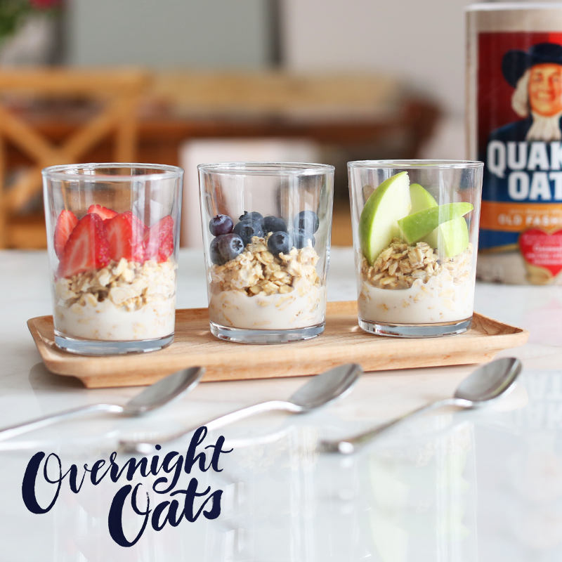
Inspired by our social media learnings, in 2015 Quaker began investing heavily in content to drive awareness of the overnight oats trend during the spring and summer, when the brand typically sees a dip in hot oatmeal consumption.
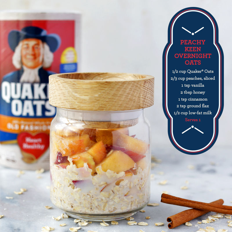
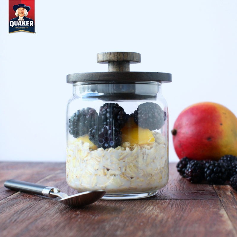
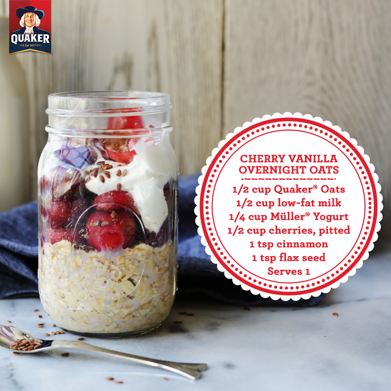
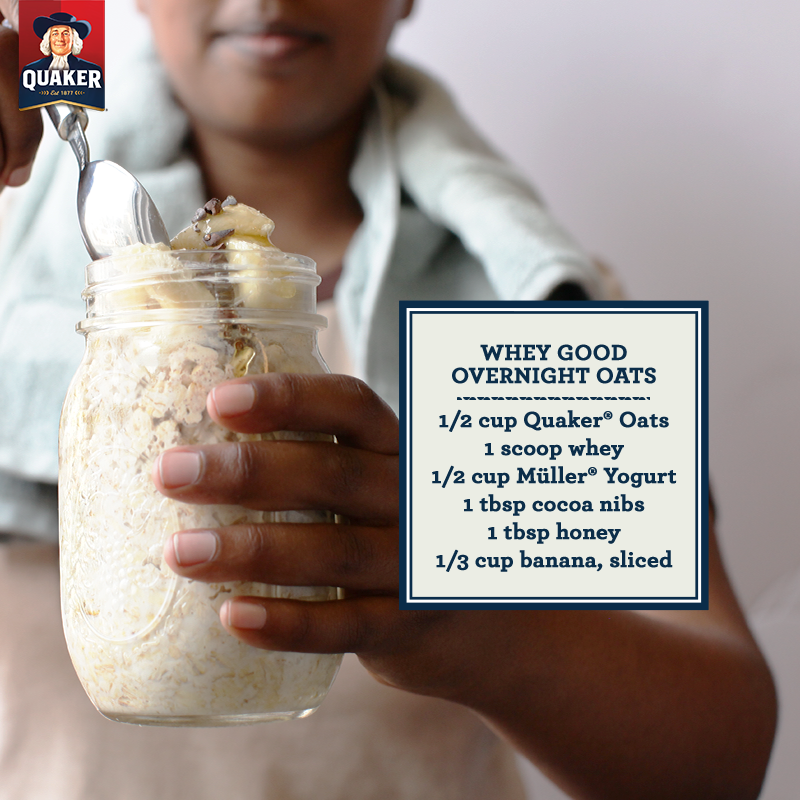
Our work was driven by the elevated, editorial style we’d begun developing for Quaker in 2014 to differentiate it from competitors in the breakfast space. We incorporated cool surfaces, accessible toppings and a stamp motif so recipes could live on the image and still be platform-optimized. Since overnight oats were new for many consumers, images had to be appetizing and easy to understand. Adopting this use case, Quaker was able to broaden their audience and continue to modernize their brand, with digital and social content leading the charge.
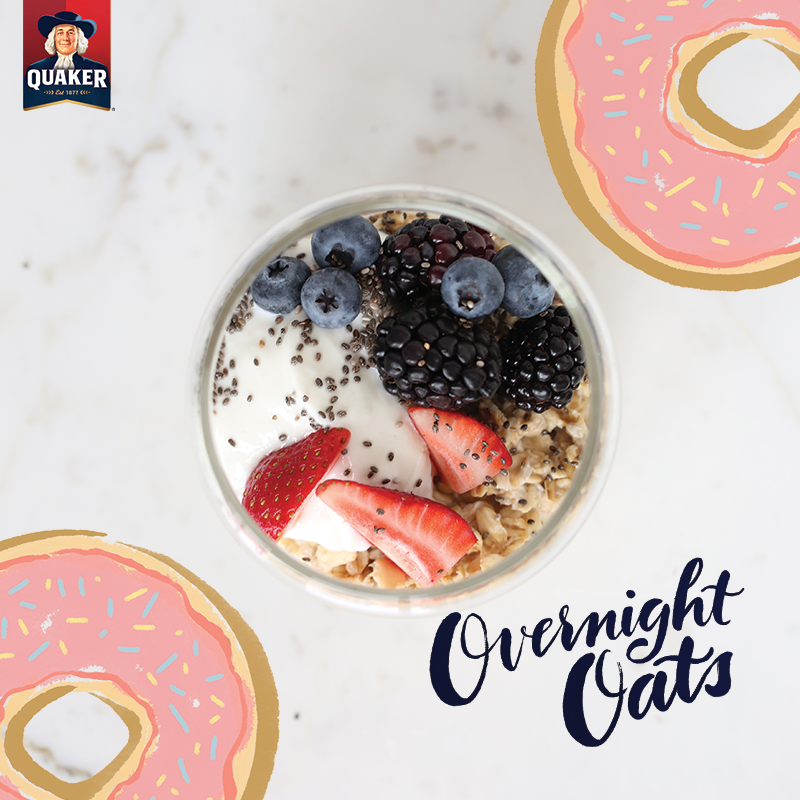
In 2016 and beyond, we continued to contemporize Quaker with illustration and a hand-lettered font created by our lead art director Michelle Dimuzio.